
CARLTON
DEVEREAUX
User Experience Designer

Building Forkast
Forkast is a platform designed for restaurants to better communicate their menu visually with dish ingredients, to their customers.
Visual importance. We have the good fortune of living in a very diverse environment; diners may not always be able to visualize a dish from a conventional menu. Forkast leaves nothing to the imagination!
Dish ingredients. Food allergies have become common. During our research phase, we discovered that restaurant servers don’t always communicate with their Chefs or kitchen staff on a regular basis. The words “I think” or “Let me check with our Chef” came up often as we inquired for a colleague with a severe nut allergy. One mistake was made and she had a severe allergic reaction.
This experience highlighted the importance of clear, consistent and accurate information about dish ingredients.
During our journey to create Forkast, we learned a great deal about B2C applications in the app store and the benefits of B2B clients.
From
Alpha to Beta
Project: iqr to ikur
As a team of 4, we wanted to incorporate the convenience of scanning QR codes to reach content on the web in creating our platform.
With a final concept for the technology, the next key area of focus was branding. After studying many branding articles, guidelines, and case studies, We decided that it was important to incorporate the foundational element of this platform into the branding.
Enter 'Project: iqr' ...inspiring quick response.

Early promotional material.
At this stage, we were trying
to clearly define the benefit
to the user.

Project: iqr was the early design concept for branding. On-going collaboration with the growing team resulted in a name change as 'iqr' didn't quite flow and seemed difficult to pronounce accurately.
We made the change before we started to test the product.
We settled on the name Project: ikur (pronounced 'ick-er') We replaced 'quick' with 'kuick' ...inspiring kuick response. This seemed easier to pronounce and stood out from the crowd.
Once the new branding was finalized, the development and testing began.

Identifying the true customers:
restaurant owners & diners
To better understand our user base, we focused in more depth on how menu items were presented by restaurants to their customers.
Diners. We found that visuals of the dishes were extremely limited and rarely available. Additionally, ingredient information was not always complete; highly allergenic ingredients were rarely flagged. The future Project: ikur user required better and more consistent information: appetizing visuals; complete ingredient list; flags for highly allergenic items.
To give the user access to this information with the utmost convenience and efficiency, we had to provide a simple solution. The user simply scans the QR code associated with the restaurant's menu to gain the visual and dish ingredient information.
Restaurant owners. We also couldn't ignore the power of social media. To give the restaurant owners maximum exposure, we wanted to incorporate a function that would allow the diner to easily share their dining experiences and promote the restaurant and/or a specific dish with their social media communities.
Simplicity. There are many applications and forums available for diners. Simplicity, consistency and complete information was our focus in developing a superior platform. To emphasize the simplicity of Project: ikur, we incorporated four words into our branding. Scan. See. Eat. Share.
We kept the ideas flowing and the discovery on-going of how best to relate content to the user while being different from other applications in a similar space. Next step was to present to a restaurant owner and the head Chef to gain more insight. We identified a tester, a Bay Area French restaurant owner/Chef who saw immediate benefits of Project: ikur for his establishment.
His desire to see us succeed was the basis for an excellent partnership.
Our goal was to find 5 more partners like him to test the platform, alpha through beta.
My background as a product designer added insight on human factors. My teammate's background is in visual.
Together, we were able to work on the UI visuals and the UX experience.


For ease of communicating our platform to the user, we created a branding slogan to describe Project: ikur.
Scan.
Use your phone's built-in bar code reader to scan the menu QR code.
(We promoted qrdroid on the android market and IR for the iPhone.)
See.
Once scanned, the link opens and your're instantly brought to our CMS. The screen is populated with menu images and data from the restaurant.
Eat.
Need we say more?
Share.
You are encouraged to share the restaurant and/or dish on your social media feed by simply pressing the like button.
Experience
Who?
The team continued to evolve. We were now a team of 4: 3 designers and 1 software engineer. We had now developed a CMS that could manage the Project: ikur content.
What?
As we continued with development of the initial concept, our goal was to give the user instant gratification. The menu QR code was the driving factor of the platform.
Why, why, why?
After meeting with our tester, it was clear that we needed a deeper understanding of the benefits to restaurant owners and chefs.
Via the Share function, users could promote the restaurant via social media.
But what else? What other value could we bring?
Project: ikur would save the restaurant owners and chefs time by allowing standardized menu uploading and revisions.
Time equals money. Understanding this gave us leverage.
How? The Alpha system.
We launched our first alpha test with the Bay Area French restaurant. We tracked usage and got no hits!
The problem?
Diners were not used to the experience of a QR code. They would have to be educated by the servers. With collaboration with the tester, we created educational materials for the servers and internal advertising for the diners.
After implementation of these phases, we waited to survey the customers: servers and diners. The feedback confirmed that these components were necessary for product understanding and optimization.
More questions...
Will we need to do this for everyone? How will we scale?


Jon Doe
Wire frame example of what the social media feed could look like and how it could promote the restaurant.
At this point our plates were full! It was important to reflect on where we were: we had a deployment plan for market penetration; we were working in agile; we were receiving constant feedback from our one tester and users. But it was obvious that we needed to seek out more testers. In San Francisco, this was an uphill battle. Restaurant owners were being contacted by multiple start-ups to collaborate, some on a daily basis. To overcome this obstacle, we had to think outside of the 7 x 7 box (literally).
We approached an untapped area in the Bay Area, and an up and coming market in Arizona.
Before approaching new potential testers, we further defined the Project: ikur marketing plan and platform. This helped us grow our confidence and ask ourselves 'why not pitch to a bigger fish'?
Pitching to the team
Understanding demographics

A growing team!
Bay Area demograhpics.
We tested internet speeds and gauged interest in tech throughout the Bay Area. Venturing too far east, restaurant owners had very little interest in social media, tech, etc. They relied on loyal
customers. Moving too far south was intruding on the Silicon Valley, where competition was fierce. However, we did find some hot spots surrounding San Francisco; we chose South San Francisco. As the home of San Francisco's international airport and the hub for corporate meetings, it was a market that was eager to further incorporate tech.
Arizona.
Arizona was a relatively untouched market when it came to startups in the restaurant industry. Competition for us was slim.
Additionally, the "want" in Arizona to be technologically on par with the Bay Area was in our favor.

Working prototype


Time to deliver.
The prototype was good! We had used HTML, HTML 5 and some Javascript to build version 1. This version allowed us to display the functionality and ease of the platform.
At this point, we had several testers in the Bay Area and Arizona. This would be our entry into the market place.
Project: ikur in action...

Step 1

Step 2

Step 3
During user studies, we observed individuals on restaurant-lined streets reviewing different menus.
They all retrieved information in the same way: walk up to the menu; review it; note interesting dishes; walk to the next menu; come back to re-review if necessary.
Through Project: ikur, we were able to provide the user immediate access to the menu via a simple scan. They were then able to electronically take the menu with them.
Now that we had the platform to provide menu information to the user, we were ready to look at other benefits the application could provide.
We learned that one key element that separated us from other menu apps was our unique and customized relationships with our clients. Rather than scraping websites for limited menu information, by building individual relationships we could leverage the information that couldn't be scraped.
Allergy info and you


Having a relationship with our clients allowed us to gain access to dish ingredients.
This gave us a unique opportunity to categorize allergy-related food content.
Our goal was to stand out from the other online sites and applications by bringing meaningful benefits to the true customers. Regardless of language barriers, lack of the server's knowledge, or failure to ask by the diner, we wanted to make highly allergenic ingredients obvious to everyone.
The pivot and redesign
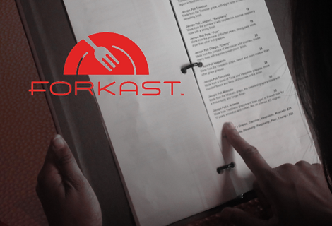
Enter Forkast
Our vision was to bring a product to market that would be valued by the users: restaurant owners and diners. We quickly learned that if the value is not obvious to the user, the product can be labeled as a fad.
By learning more about other applications that are driven by users, we noticed a trend. Users will download a popular app, however, depending on other options available in that market, users will often switch to a different, newer app. For us, we realized that the value was not in the B2C market, as this was much more of a gamble. The real opportunity was in the B2B market. We now better understood the differences between an app in the app store and a platform provided by a startup company. This knowledge inspired us to change courses or “pivot”.
We made the decision to change the branding, name and logo.
After this, we were ready to leave Alpha and enter Beta. We had several clients, the biggest of which was Houlihan's located within a Holiday Inn. We had advisors from VMware who guided us through this unique partnership and generated interest in our platform from the corporate offices of both entities.
The team's logo journey, a new brand and the power of Agile methodology


During logo development, we finally settled on a font.
Afer weeks of re-branding, we reviewed the entire design and experience of Forkast.
Problems to overcome
Having the allergy content on separate pages caused a prolonged load time that would not be acceptable to the user. An additional complexity was that Forkast was a web app and not a native app. We began to research how we could more efficiently display allergy information by using icons on the first page.
Button layouts were also a problem as we wanted to reduce the interaction time for the user. We knew we had a unique opportunity to provide the most effective and efficient platform. With that in mind, we tried to push the boundaries of a menu platform during the redesign.
The platform's back-end still needed to be created for the client. At this point, we were populating the content for our clients. The first version of our CMS was introduced to our first tester. His feedback was that it was too complicated for the user. He needed something faster and easier. So we took a step back and went into redesign mode.
There was also the question of how to bring value to desktop users. What experience would these users have? This is something we had to consider during the next phase.
Original site map

Even though the original site map had promise, we decided that a redesign was needed. We began plans to move away from the QR code strategy and develop the native application.
At this time, Forkast was preparing to enter the hotel and chain restaurant markets, starting with test sites.

Beta to Launch.
To ensure success in moving from Beta to a launched product, we knew we needed to educate users. We created table tops and other materials in order to accomplish this goal.


A look at the design language used in Beta.
We also needed to update the design language used in Beta.
Users commented on using the bright screen
in a dining environment
Transitioning between screens on a web app, users
noticed the delayed time between screen transitions due to signal lost. Our solution was to prepare for a native application with cached data
New Goals
We were on the quest for a new look and feel. One that would provide the functionality that our users expected, but would also provide a memorable experience. We already knew of one way to enhance the user experience; that was to use excellent quality photos of the dishes. But we wanted to get deeper. We wanted to make the connection between the user and the restaurant's Chef. We decided to incorporate a section to introduce the Chef, tell his/her story and highlight the uniqueness of that restaurant.
Desktop look and feel
Optional design directions


Team ideation sketches for mobile and desktop

Although we came up with several ideations, it wasn't quite what we were looking for.
Our goal was to create a fresh feel with a clean design. Using inspiration from varying sources, our goal was to set a trend for
the user experience with
restaurant menus.

After completing the ideation phase, we settled on a unique design that highlighted important areas, such as a Chef's bio, and mouse-over categories.

We settled on our logo design direction, and the team agreed that this was the new logo for Forkast.
Mobile
Exploring the mobile side gave us opportunity to look for trends. We learned about some great tools and up-and-coming patterns. As we explored and went through the ideation phase for mobile, we applied the same design philosophy we used for the desktop process.


Icon selection for sceen selection


After researching trends and patterns, we learned that the next trends were the button fly out and categories.


Redesign suggestions implemented by the team
Sketch of proposed design for button layout

The new design began to surface. However, we noticed issues with alignment of the mobile splash page. As we made adjustments, we continued to ideate the process. This allowed us to take a step back and have another overview of the platform.
We kept in constant contact with our clients. We collected necessary information such as the Chef's bio and photos of the dishes. This allowed us to continue moving the project along.

Scroll test page for buttons. Buttons are on screen but when user scroll down buttonts slide to the left revealing the entire screen for view.
Approaching the final stages
Final design bfore release.


Nav button sizing and icon exploration. We realized we were dealing with food so the images needed to be the first read that the user experienced.

Highlighting the Chef and adjusting the header for consistant menus

Constant communication between design and engineering for proper
design layout.
From Project: iqr to Project: ikur and finally Forkast; this was the team's journey in the quest to deliver the best user experience in food menus.
We learned a lot during the concept and design development phases. We grew as a team and as individual designers.
Most importantly, we identified who the true customers are and how to best meet their needs by working collaboratively, communicating clearly, and building lasting partnerships.


INTERACTION DESIGN UX RESEARCH STUDY


